What I’m Reading
Shareworthy articles and content syndicated from other sites. These aren’t things I’ve written or necessarily endorse, for the record.
Architecture v. Web Design
I used to consider web design and architecture alike. The famous Roman architect Vitruvius has set out in his treatise on architecture, de Architectura, that architecture should fulfill three things: strength, utility and beauty. In essence this is what a web design should fulfill also, with maintainability reflecting strength and usability reflecting utility. But while these three goals are shared, the essence of the two fields is actually quite different, so much so that in a way they could be considered opposites.
The essence of architecture is the creation of space. Space is the end product of architecture. It is not the stone walls, the wooden floors, or the marble columns, but the space created within them that will be used. The objective is to elevate that space—to make it interesting, inspiring, useful, livable. Web design is the opposite of that—it’s the presentation and organization of content. Space is used as a tool, but it is not the main material or the end product. The end product is the content itself.
I make this comparison to illustrate the two different approaches to design. I wrote yesterday about the content centric approach that derives the design by styling and spacing the content itself. The opposite approach to that would be to create the “design” first—the content frame, header area, navigation bar etc.—and then slot the content in when you’re done. This approach is popular with pre-made templates or designs where Lorem ipsum is used as dummy text, and happens when the designer doesn’t have the content on hand.
What happens here is that this approach to web design begins to reflect architecture, where the creation of space becomes the goal, and in this case the framing of that space. The problem with this is that the design is not optimal for the content, it’s at best a guess. Additionally, because space starts to become the objective, the frame becomes the means of satisfying the objective, and so we have superficial visuals that are created for their own sake that begin to look like those intricate baroque picture frames.
Yes, the end product may look good, but this sort of design isn’t real, in the sense that you’re not working with the thing itself, but merely creating a container to place it in. But the container is not the goal of web design, it’s what’s inside that matters, and good looks is not the most important attribute for most websites. This is why working without real content is a bad idea. It sets up a trap—a trap that flips the primary goal of the design from presenting content to presenting space, and once this trap pulls you in you’ll find that you’re no longer solving problems, but merely decorating.
E-Books See Enormous Growth As Paper Book Sales Dive
 A report from the Association of American Publishers reveals that e-books sales experienced “powerful continuing growth” as they colorfully put it, and paper books of all types dipped, compared to the same period (January-February) from last year. This isn’t surprising news, mainly because it isn’t news — and even if it were, it’s just history repeating itself; we’ve seen the same thing happen to music.
The parallels are clear, though the situations and reactions of the RIAA and AAP are somewhat different. Mostly in that the AAP and other booksellers aren’t being dragged kicking, screaming, and suing into the future, but are embracing it despite its implications.


Exploring UI Scaling
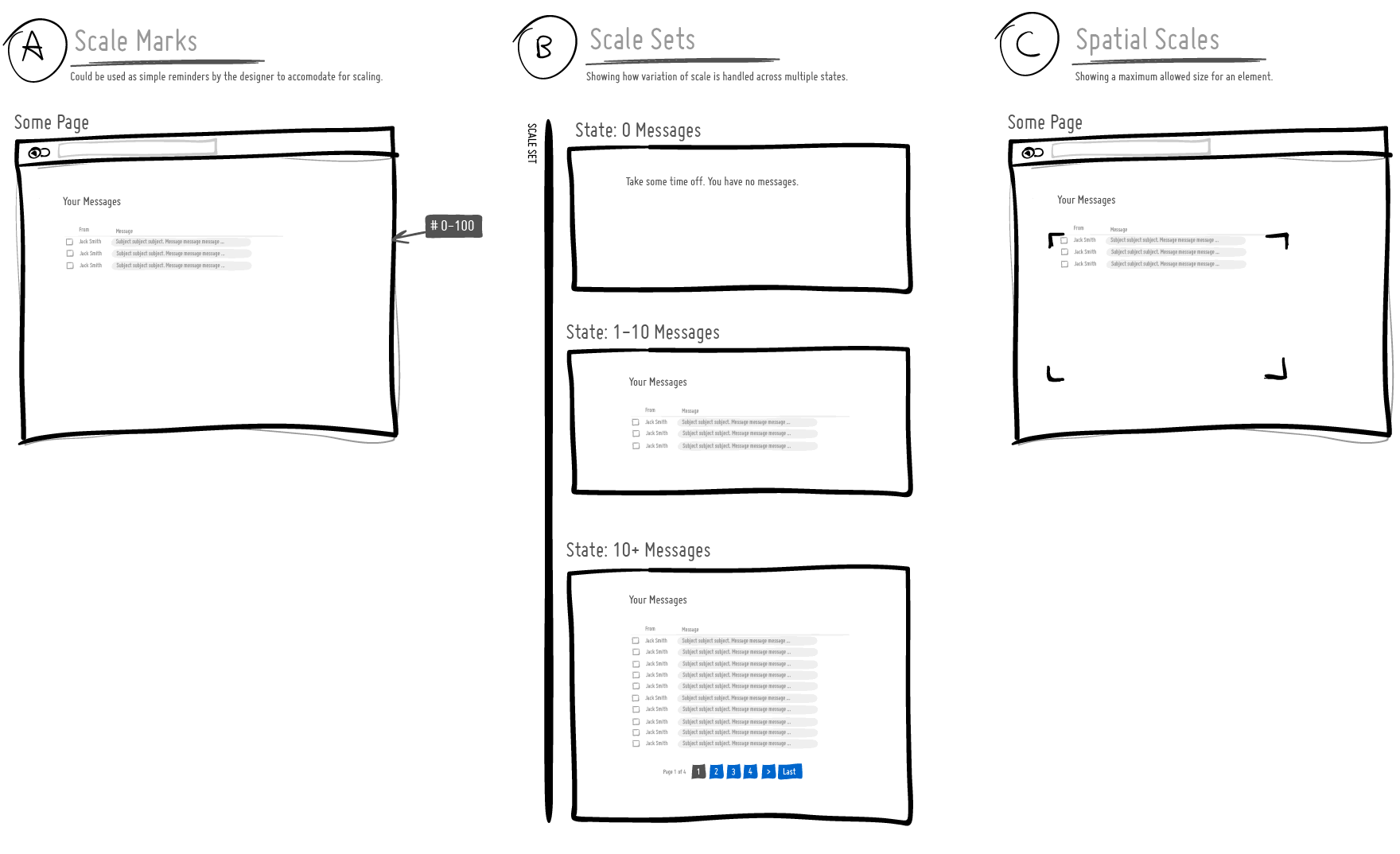
I’ve been thinking about ways to communicate how a user interface scales over time as the amount of information it needs to support varies. For example, sometimes the UI has to support multiple cases ranging from no results, to just a few results, to thousands of results. A good interface designer would probably think this through and come up with a UI that fulfills all of the relevant cases. For this, I began exploring a couple of visual language ideas to help myself and others who would like to tackle UI scaling. Here are some open and experimental thoughts:
A) Scale Marks. These are just floating reminder notes alongside a screen with a range of information that ought to be supported. Sometimes it’s easy to forget (or not know) how much data a UI really needs to support and these could be used as small self-targeted tests of sorts.
B) Scale Sets. This is a grouping of all the multiple UI states for those times when we actually want to draw out all of the relevant state ranges.
C) Spatial Scales. When there is more information, perhaps we might wish to communicate a maximum size of an element (max width / max height).
These are just a couple of thoughts which some day I might bring into the next release of the ISN. If you have other ideas, please share. 🙂 Hope it’s useful.
Credits: Jakub Linowski
New Study Shows Many Artists Think File Sharing Helps, Not Hurts
With the Dutch government introducing draconian anti-copyright policies, the government also decided to survey musicians, and the results were somewhat surprising. Many, many artists did not think that file sharing harms them, with plenty believing it helped. It appears there was a big age factor in the results — with younger artists being much less concerned about file sharing than older artists. Only 28% of artists asked believed that file sharing hurt them financially. And slightly over half of artists surveyed claimed that file sharing helps them build an audience by getting their work more widely known.
You would think, then, that this would push back against the government’s new copyright policies, but apparently, it does not.
Of course, some will also point out that even though these artists claim that file sharing isn’t harming them and that it’s often helping them… the majority still believed in DRM and stricter enforcement against infringement. That seems like a bit of a conundrum, and it appears the government basically just focused on this latter point, rather than the earlier points. But, it’s really not too surprising. If you ask someone: do you want a government-granted monopoly privelege and/or a method for limiting competition, many will say yes. Even with empirical data that they’re better off without it, it’s difficult for people to give up government protectionism… But that’s no reason to just grant such protectionist policies. It makes sense to see if a sugar monopoly actually benefits the overall production of sugar in a country. It does not make sense to ask the sugar monopolist if they need a sugar monopoly.
Permalink | Comments | Email This Story
