BibliOdyssey has put together a fantastic collection of vintage Victorian Infographics. All illustrations are collected from books like Mitchell’s New General Atlas or General Atlas Of The World from the time between 1830 to 1890. The visualizations are great examples of how abstract representation let’s a viewer grasp quantities that are hard to imagine. I strongly recommend to have a look at all of the images on Flickr.
Unique times require unique thinking, right? We’re under the cosh here in the UK with unprecendented public cuts and austerity measures. Is there a potential revenue stream we’re missing? One right under our noses? One that could solve the university tuition fees crisis? And leave around £75M left for a very, very good party. My latest graphic for The Guardian Datablog puts the case.
While on the subject, I wanted to mention a great exhibition in London. It’s called High Society. Curated by writer Mike Jay and the Wellcome Trust, it’s about the influence of (illegal) drugs on society and culture. It’s free. And features a couple of commissioned wall-sized graphics from me, including Drugs World and this Billion Drug-o-Gram.
(If this image looks furtive, it is. You’re not allowed to take photos at the exhibit. Shortly after this was snapped, I was asked to leave the building! A real moment. For once in my life, I was able to say, with authentic indignation, “Do you know WHO I am???”)
Drug Data
In the course of preparing and researching the images, we came across a ton of interesting facts and figures about the drugs world. They’re all in this spreadsheet.
Did you know…
the average purity of street cocaine is now just 27% – link
most coke in the Western world is now cut with levamisole, a toxic de-worming agent not detected by most street tests for purity (story).
the US government has spent nearly $2,500 billion dollars on the War On Drugs over the last 40 years (story)
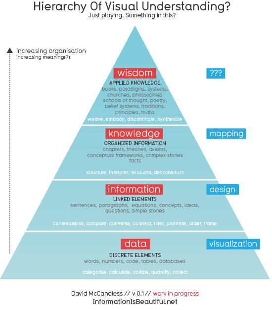
I got kinda stuck with it. So I wanted to open it up and see what you thought.
This is by no means original thought. This structure has been around for a while. (In fact does anyone knows who first came up with it?). The only new thing is relating it to visuals. And giving it a nice font.
One interesting thing. If you visualise information without designing it, you often end up with a mush or a meaningless thicket. So if you can only really ‘design’ information, rather than visualize it, then maybe the term ‘information visualization’ is a bit of a misnomer?
Anyway, how does it look to you? Does it seem logical? Truthful? Do the definitions ring true? What could be the word for the visual depiction of wisdom? Does greater verticality imply greater meaning? Or can errors creep in?
Look forward to your ideas, feedback and corrections!